Blaq (not Black) Communications | Brand Identity and Stationery Design
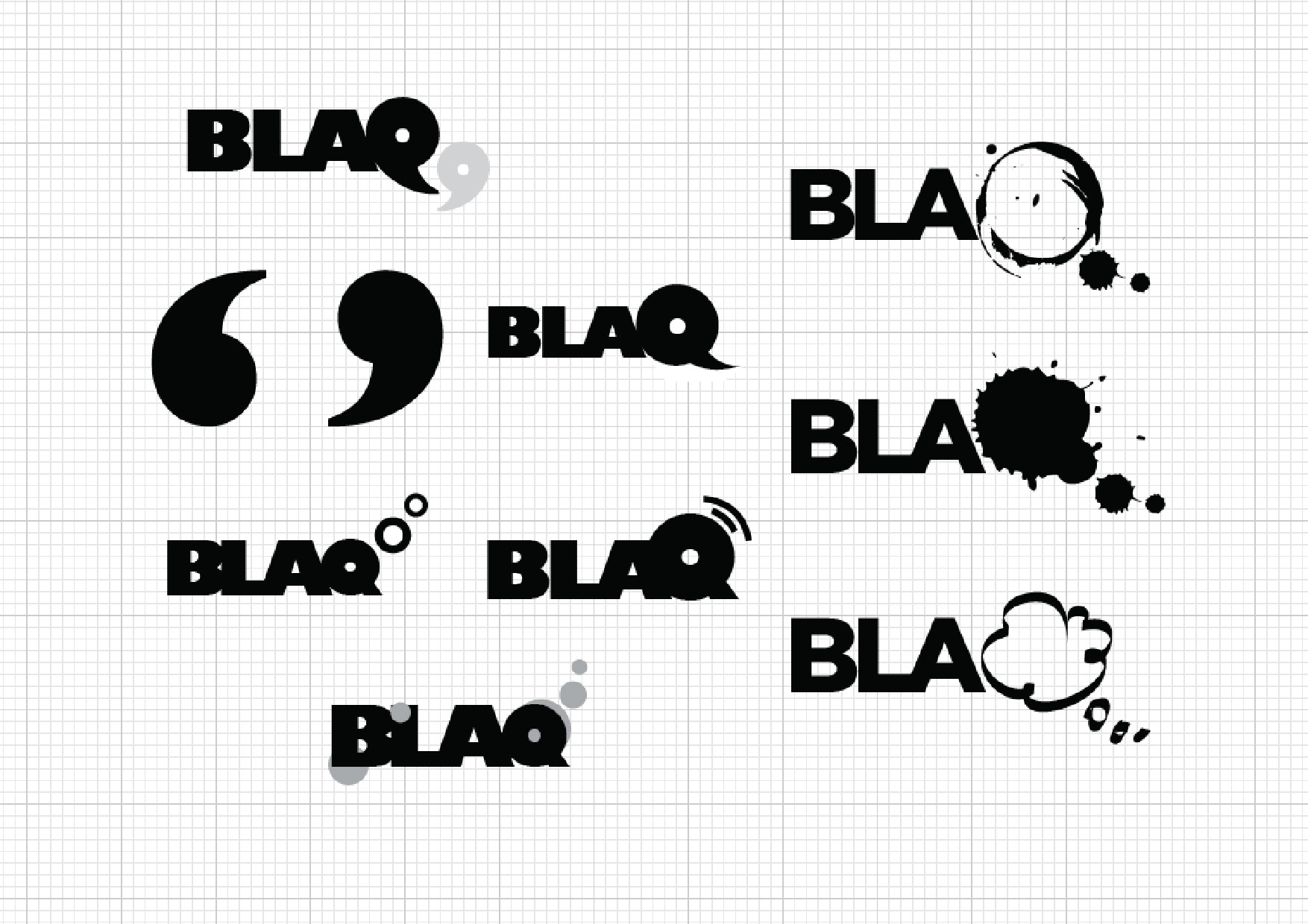
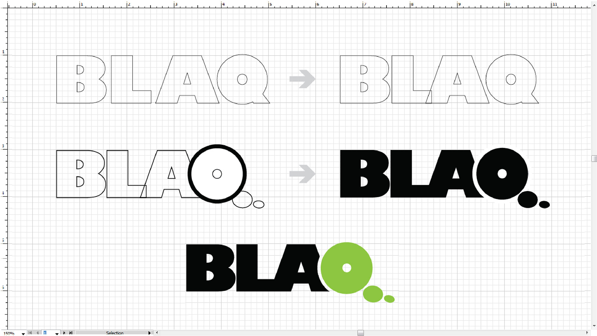
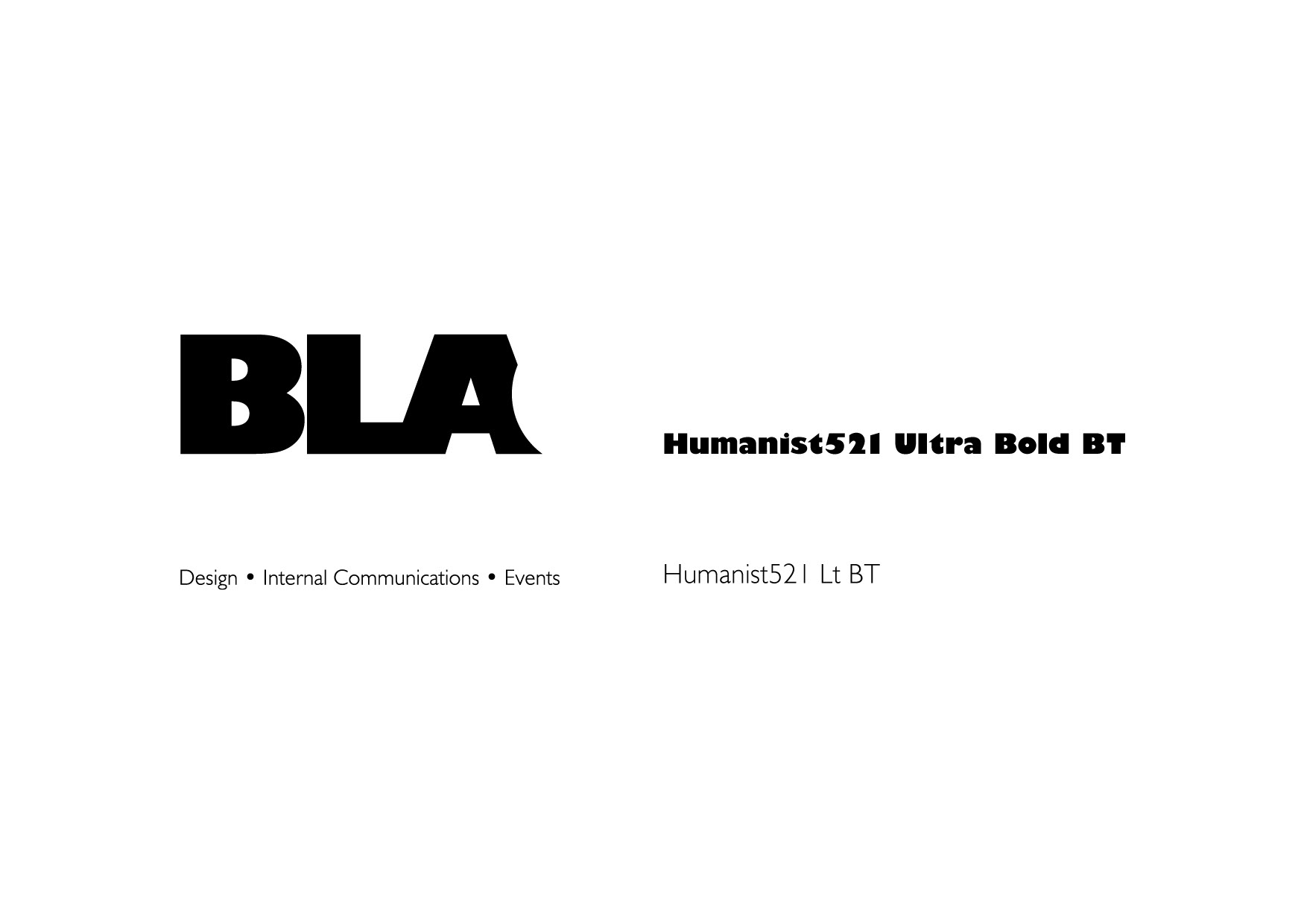
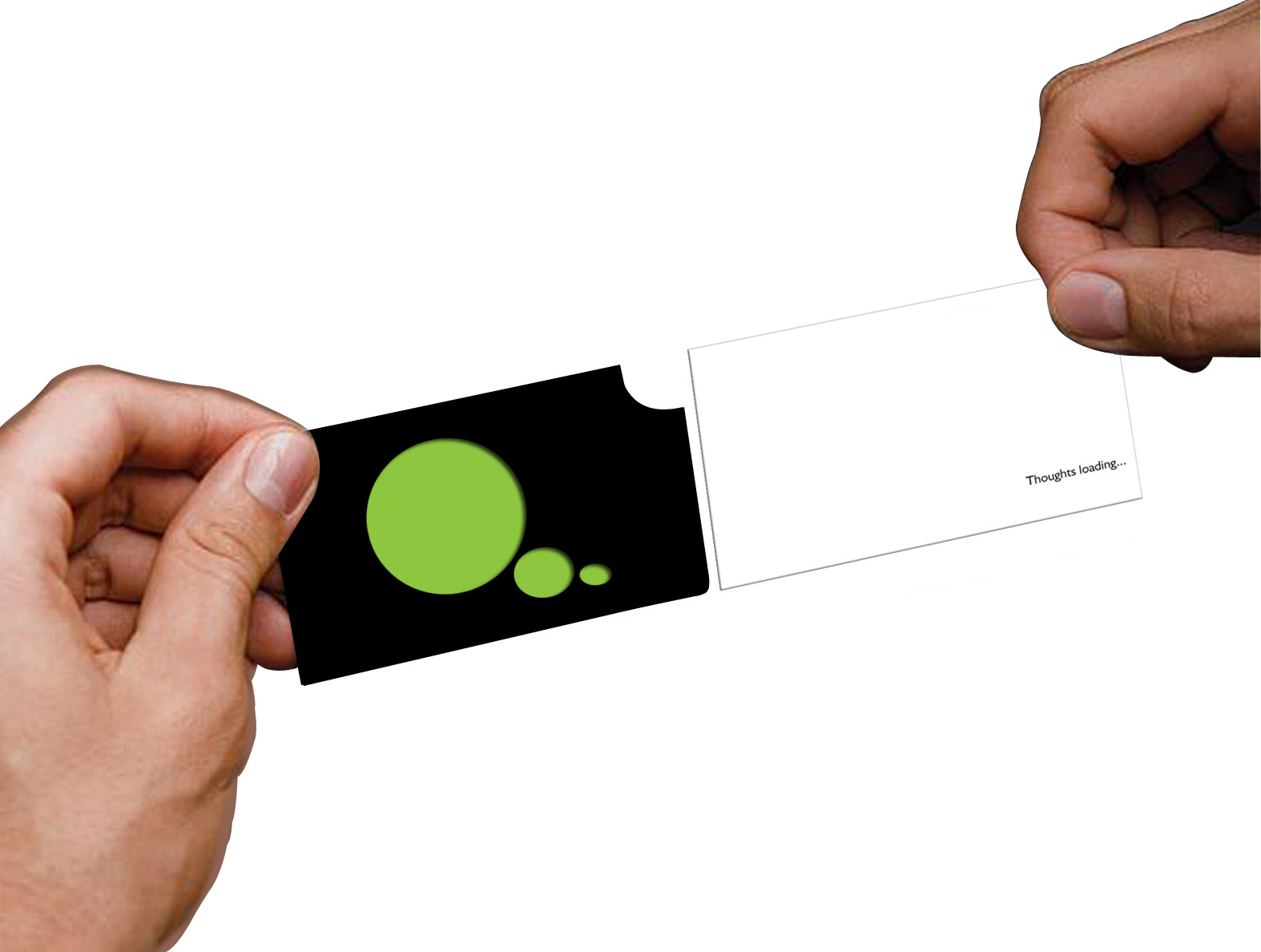
The client who is a friend of mine came with a brief saying that he wanted a company logo which specifically talk about a thought or a concept. As the word BLAQ has quirky letter Q in it, we decided to play with it. I scribbled a lot to make it like a thought blurb, speech blurb, inverted commas etc. Finally we both agreed on the thought blurb and taking advantage of a bold and smart font - Humanist, I created Q which is also a thought blurb.
The client who is a friend of mine came with a brief saying that he wanted a company logo which specifically talk about a thought or a concept. As the word BLAQ has quirky letter Q in it, we decided to play with it. I scribbled a lot to make it like a thought blurb, speech blurb, inverted commas etc. Finally we both agreed on the thought blurb and taking advantage of a bold and smart font - Humanist, I created Q which is also a thought blurb.
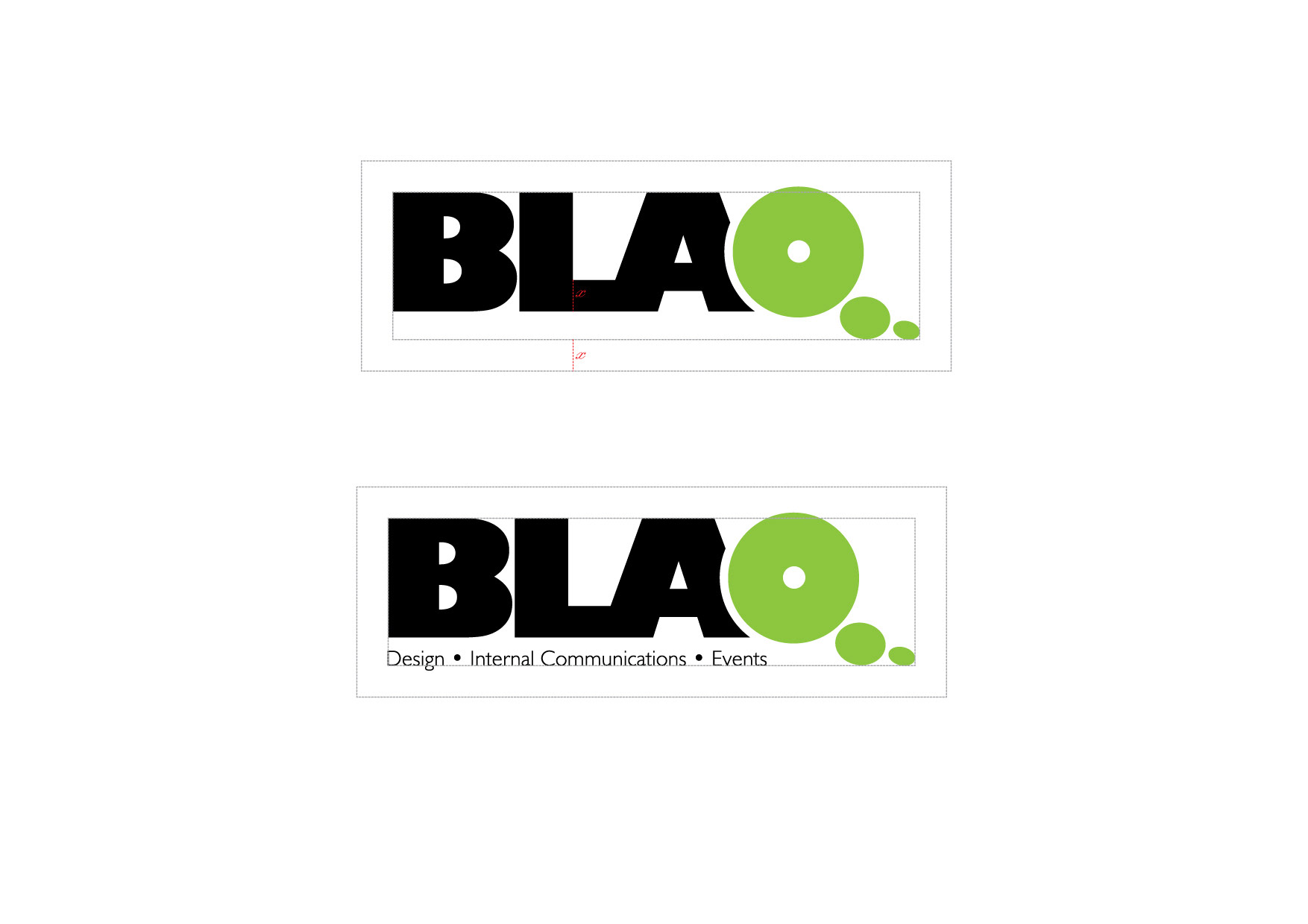
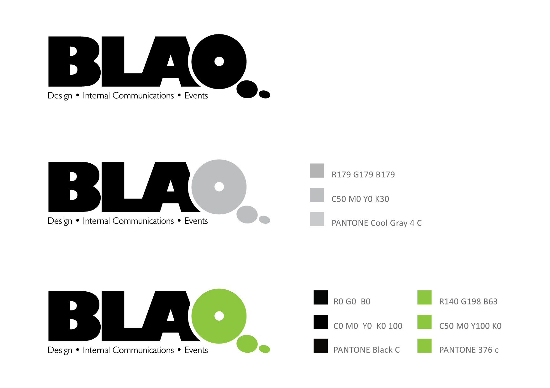
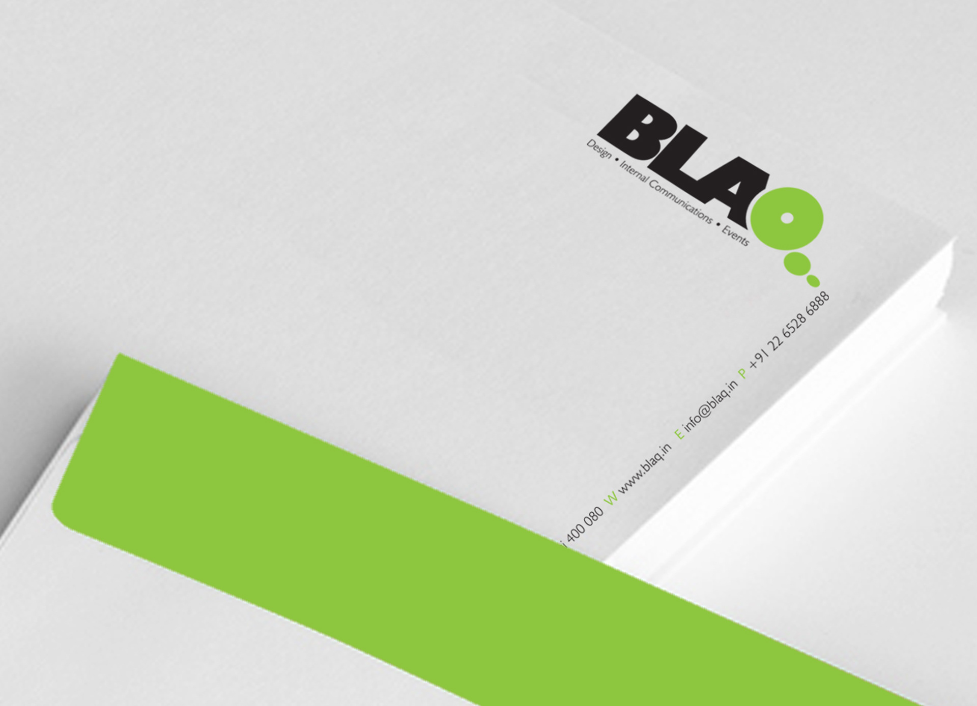
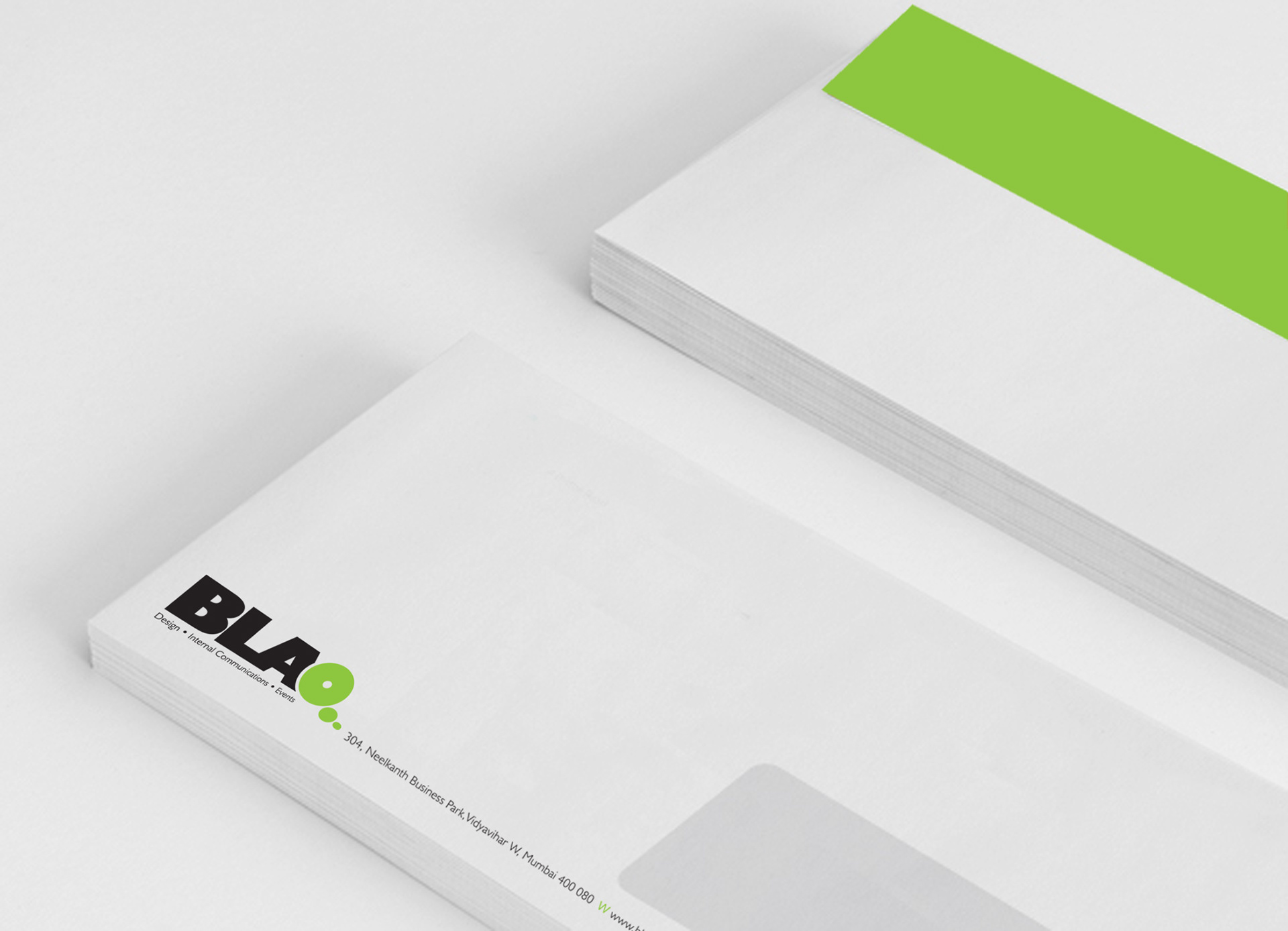
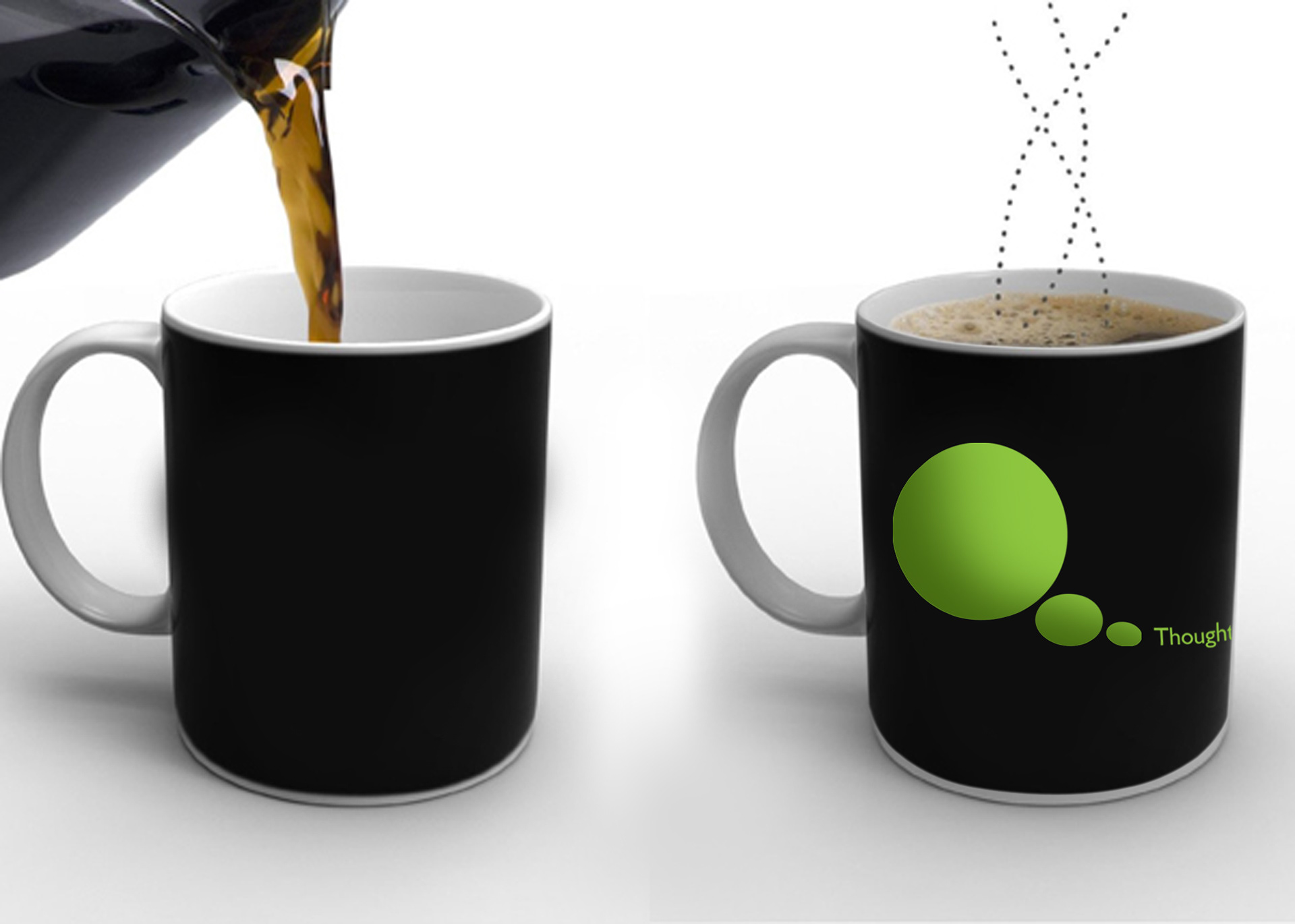
80% black with 20% of fresh green created a perfect revamp for Blaq and client was pleased with a thoughtful creation of the business card and a coffee mug.