Client: Andaaz – Restaurant, Catering, Banquet
Scope: Brand Identity, Visual System, Print + Digital Collateral, Website Design
Scope: Brand Identity, Visual System, Print + Digital Collateral, Website Design
Challenge
The challenge was to craft a distinct visual identity for Andaaz, a dream project that unites a fine dining restaurant, exclusive catering services, and a banquet hall under one elegant brand. The vision was to create an exceptional, city-style dining experience in New Jersey, featuring exquisite Indian cuisine.
The brand needed to feel modern yet rooted in Indian culture, balancing sophistication with warmth — appealing equally to fine-dining guests, event clients, and large-scale catering audiences. The identity had to unify these three verticals while giving each its own distinctive presence.
Solution
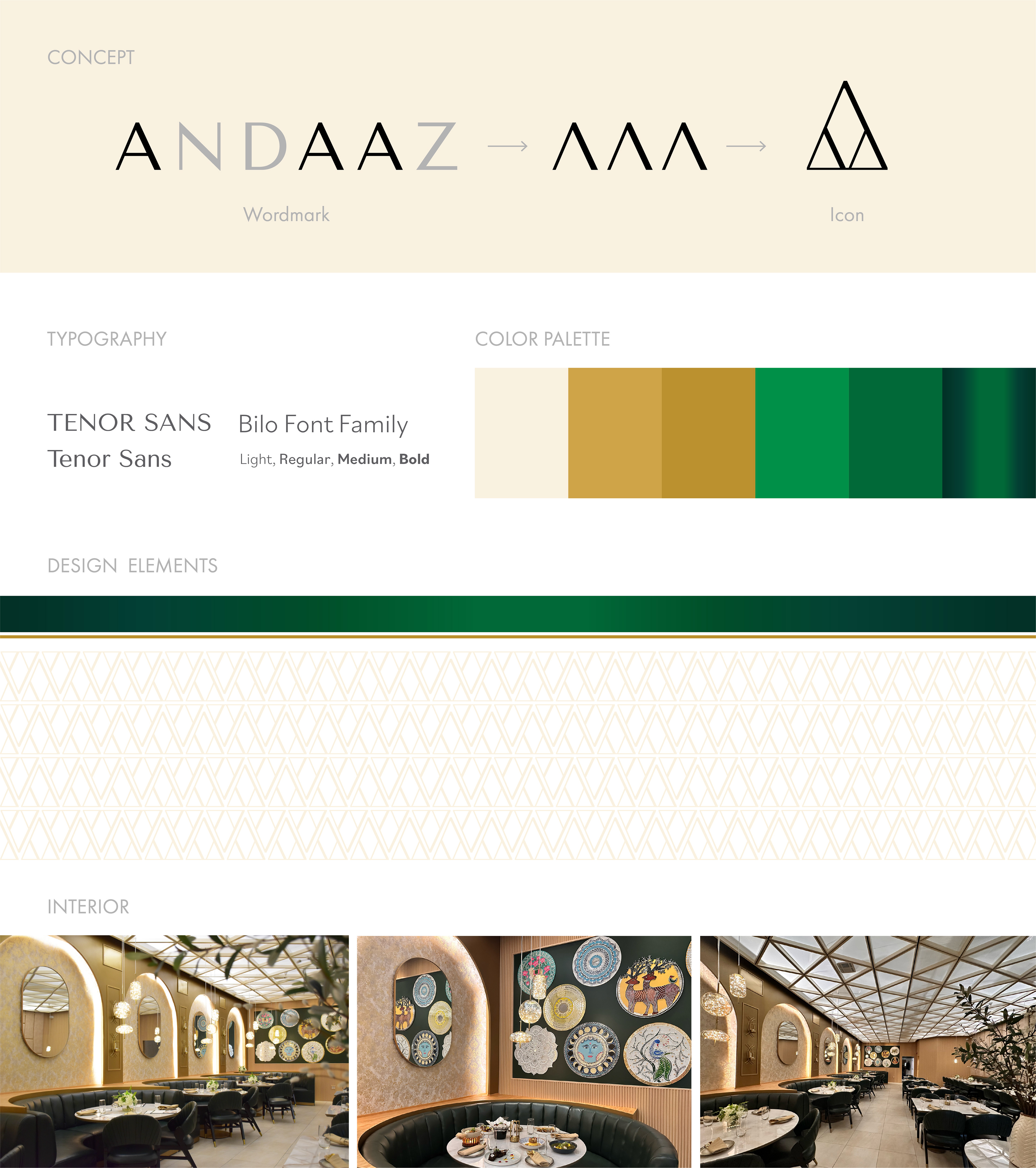
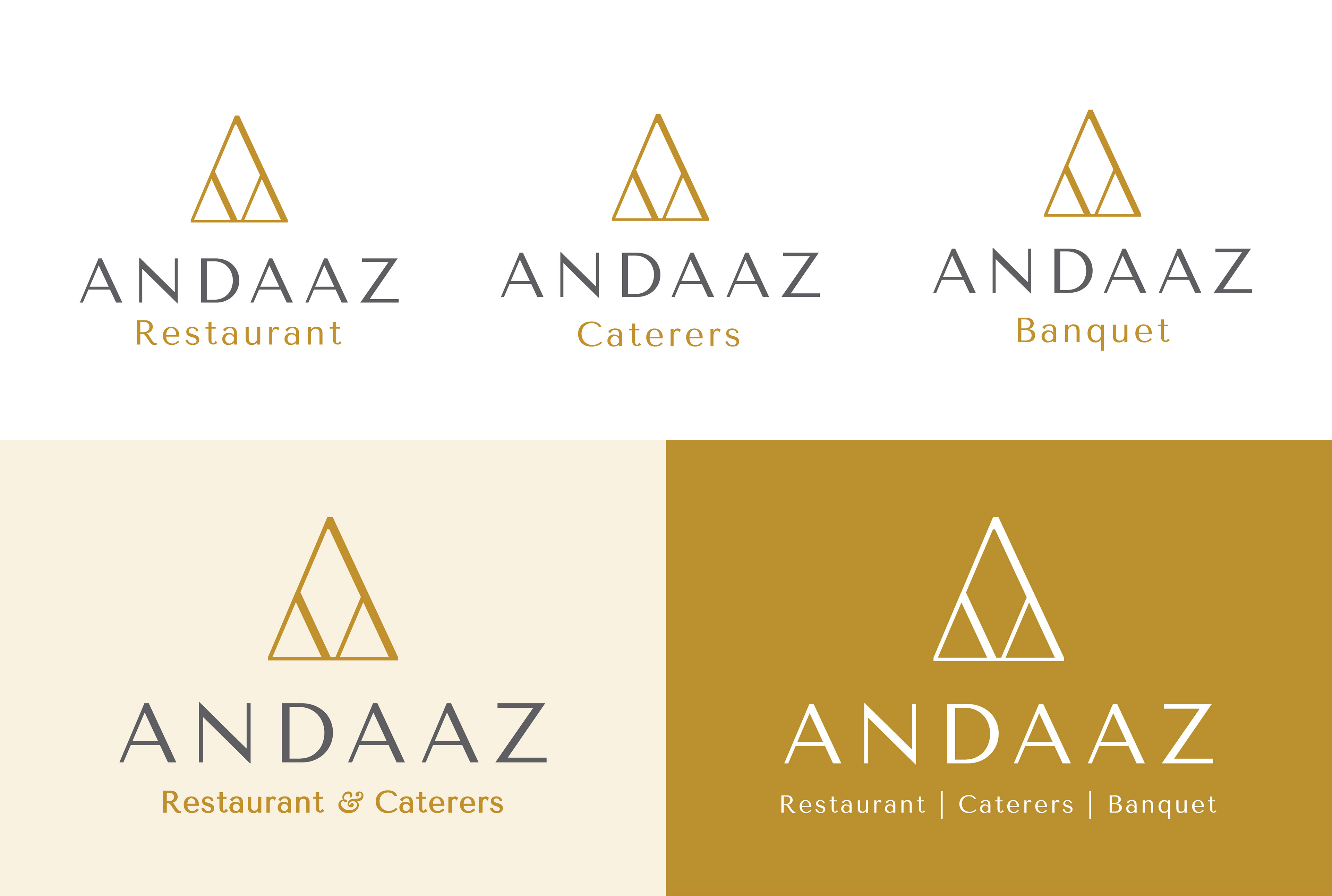
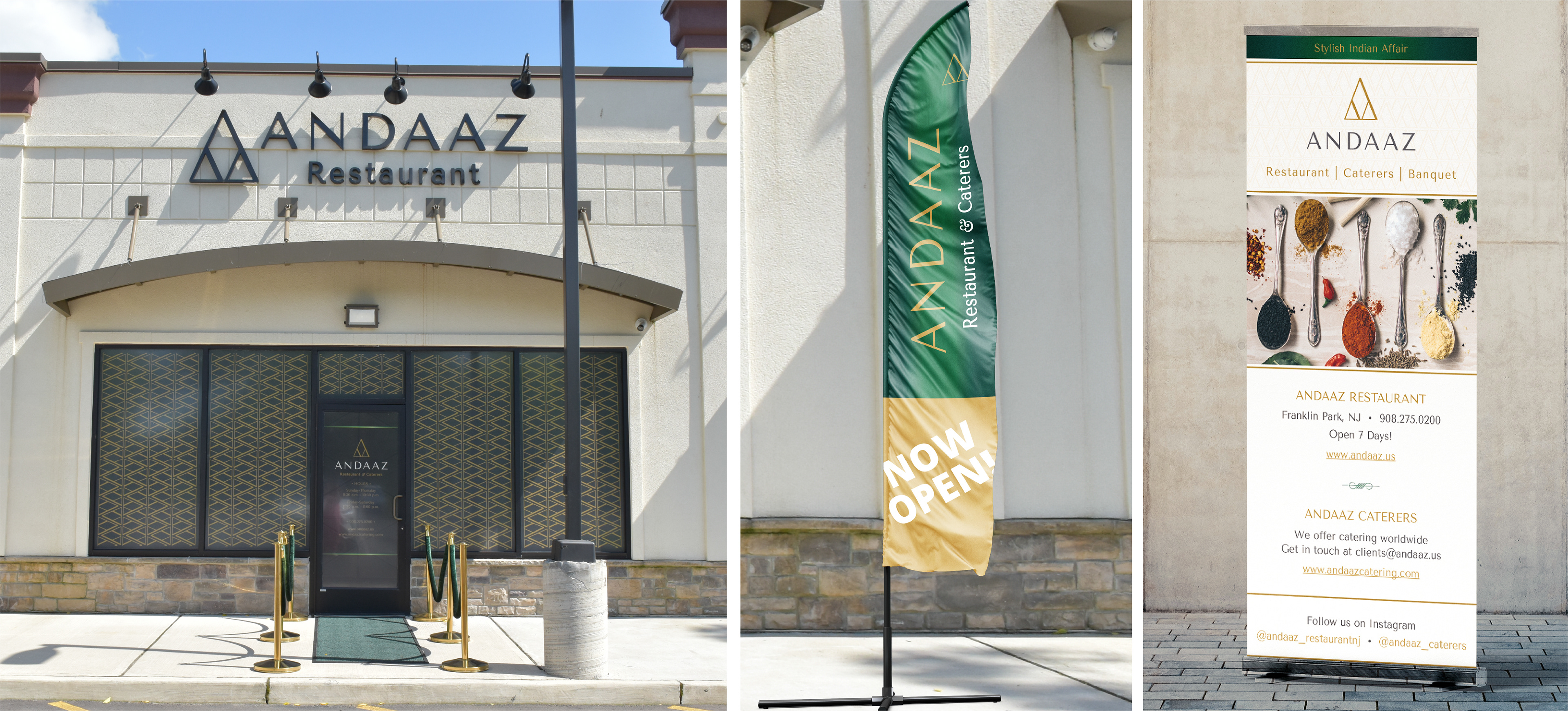
During the exploration phase, I noticed that the letter ‘A’ appears three times in the name Andaaz — each representing one of the brand’s three verticals: Restaurant, Caterers, and Banquet. The structure of the letter ‘A’, resembling an upward arrow, became a strong metaphor for growth, ambition, and celebration. This insight inspired the creation of a triangular brand icon, formed by merging three arrows into one — symbolizing unity, progress, and shared purpose. The form also evolved into a repeating pattern, establishing a distinctive brand design language.
During the exploration phase, I noticed that the letter ‘A’ appears three times in the name Andaaz — each representing one of the brand’s three verticals: Restaurant, Caterers, and Banquet. The structure of the letter ‘A’, resembling an upward arrow, became a strong metaphor for growth, ambition, and celebration. This insight inspired the creation of a triangular brand icon, formed by merging three arrows into one — symbolizing unity, progress, and shared purpose. The form also evolved into a repeating pattern, establishing a distinctive brand design language.
The brand architecture was designed to offer both flexibility and consistency — each sub-brand (Restaurant, Catering, and Banquet) has its own logo, while a combined version was developed to represent all three divisions together. To support real-world applications like menus and sales decks, an additional dual-logo version (Restaurant + Catering) was also created for seamless visual integration across collaterals.
The tagline “Indian Stylish Affaire” captures the spirit of Andaaz — the Hindi word for “Style.” To maintain consistency while differentiating the three divisions, respective sub-taglines were developed:
Andaaz Restaurant – Stylish Indian Affair
Andaaz Catering – Stylish Indian Feast
Andaaz Banquet – Stylish Indian Gala
Andaaz Restaurant – Stylish Indian Affair
Andaaz Catering – Stylish Indian Feast
Andaaz Banquet – Stylish Indian Gala
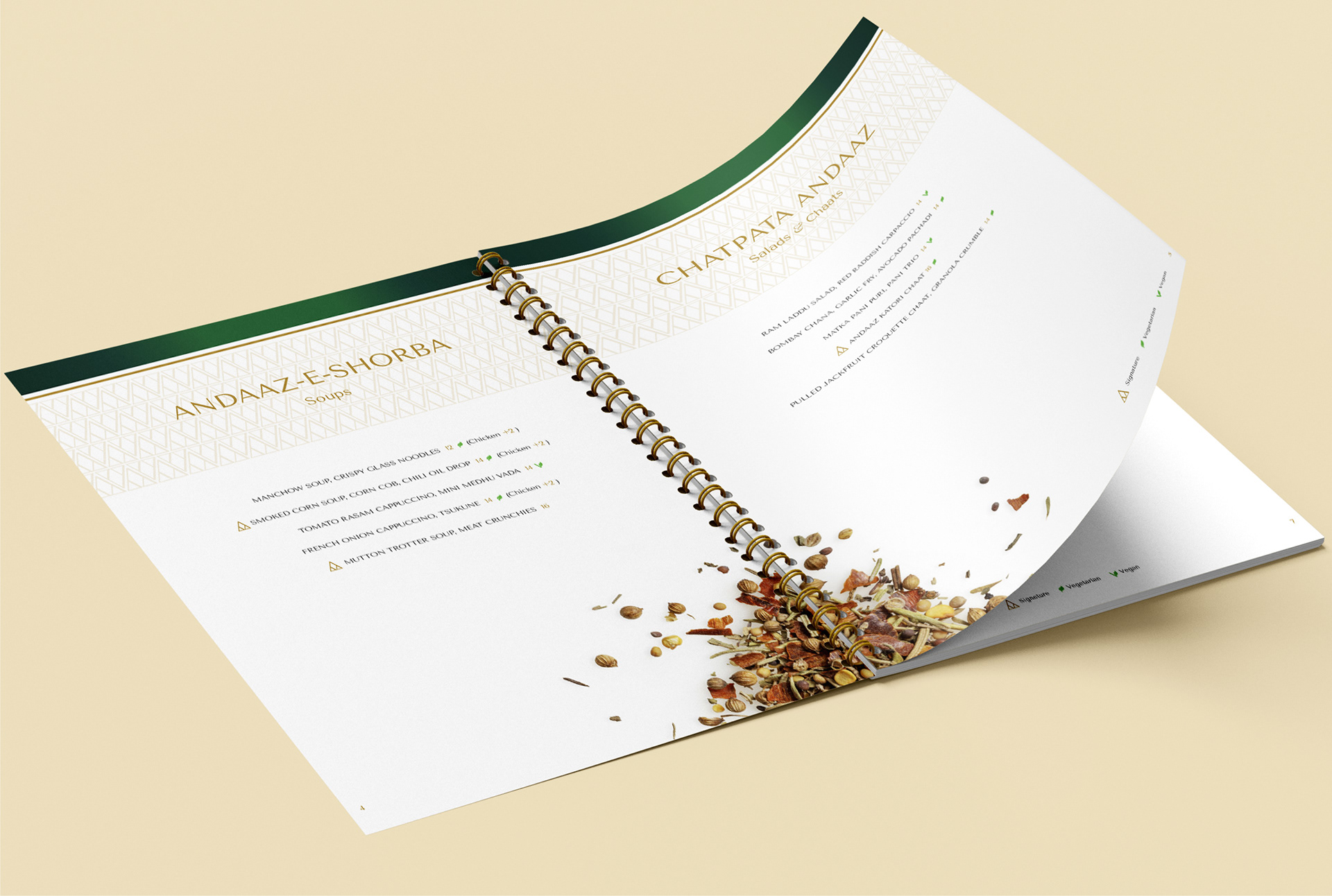
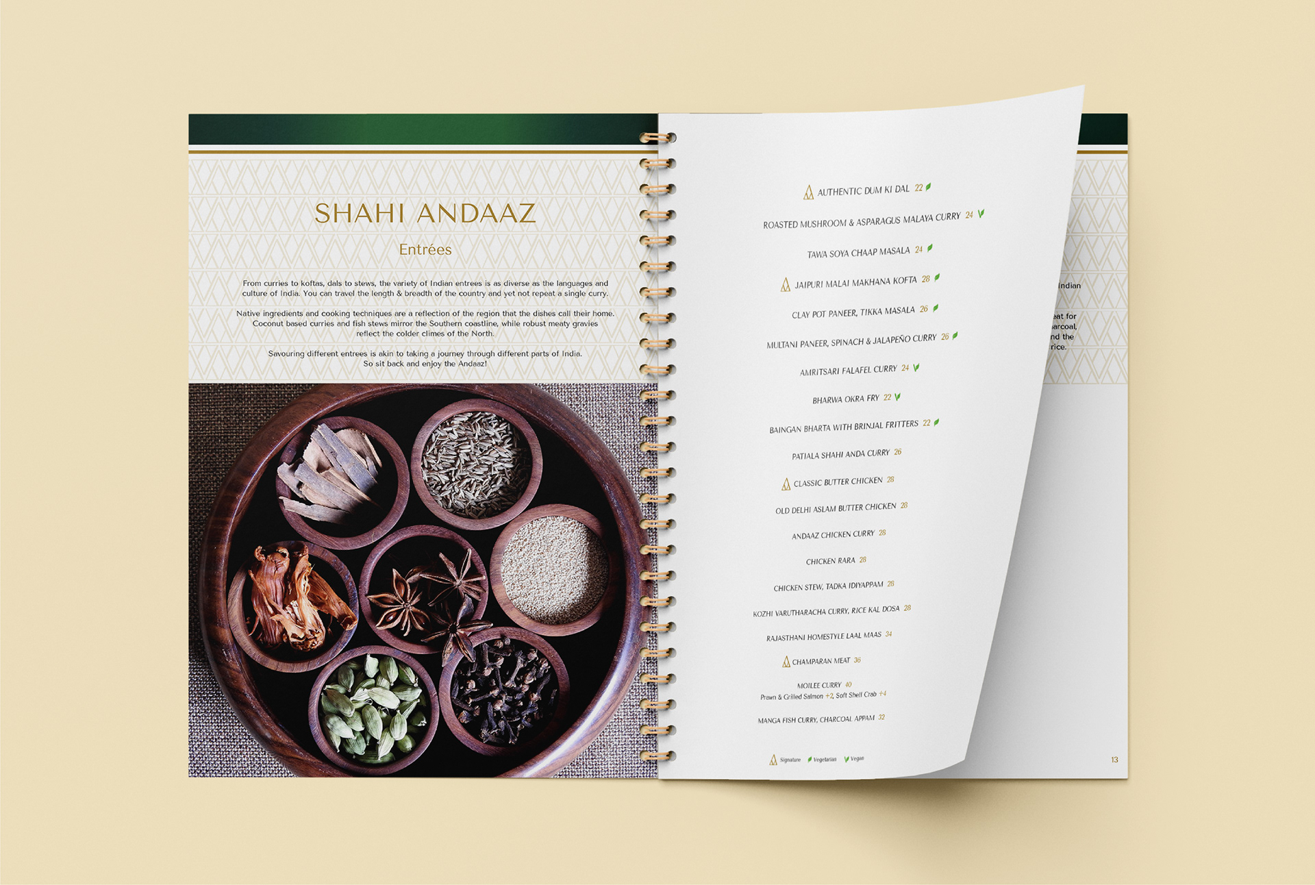
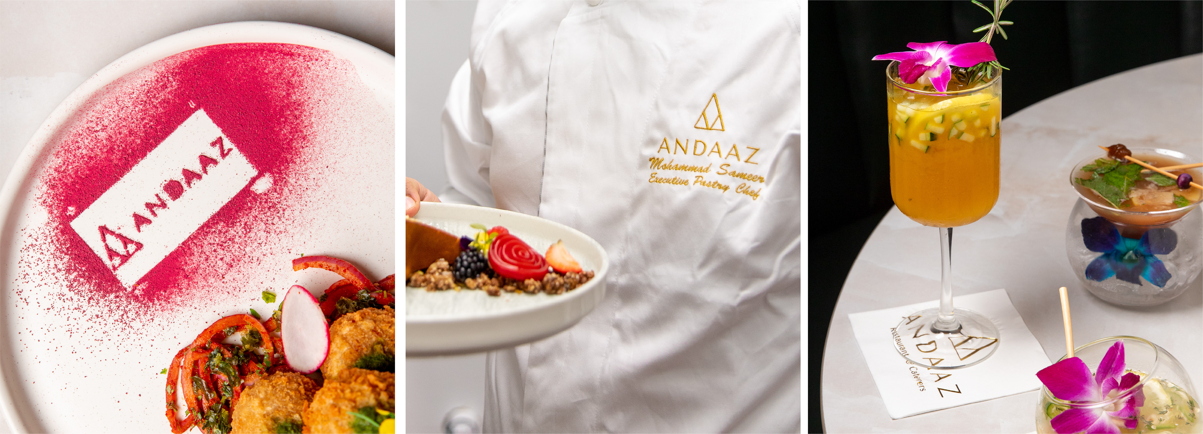
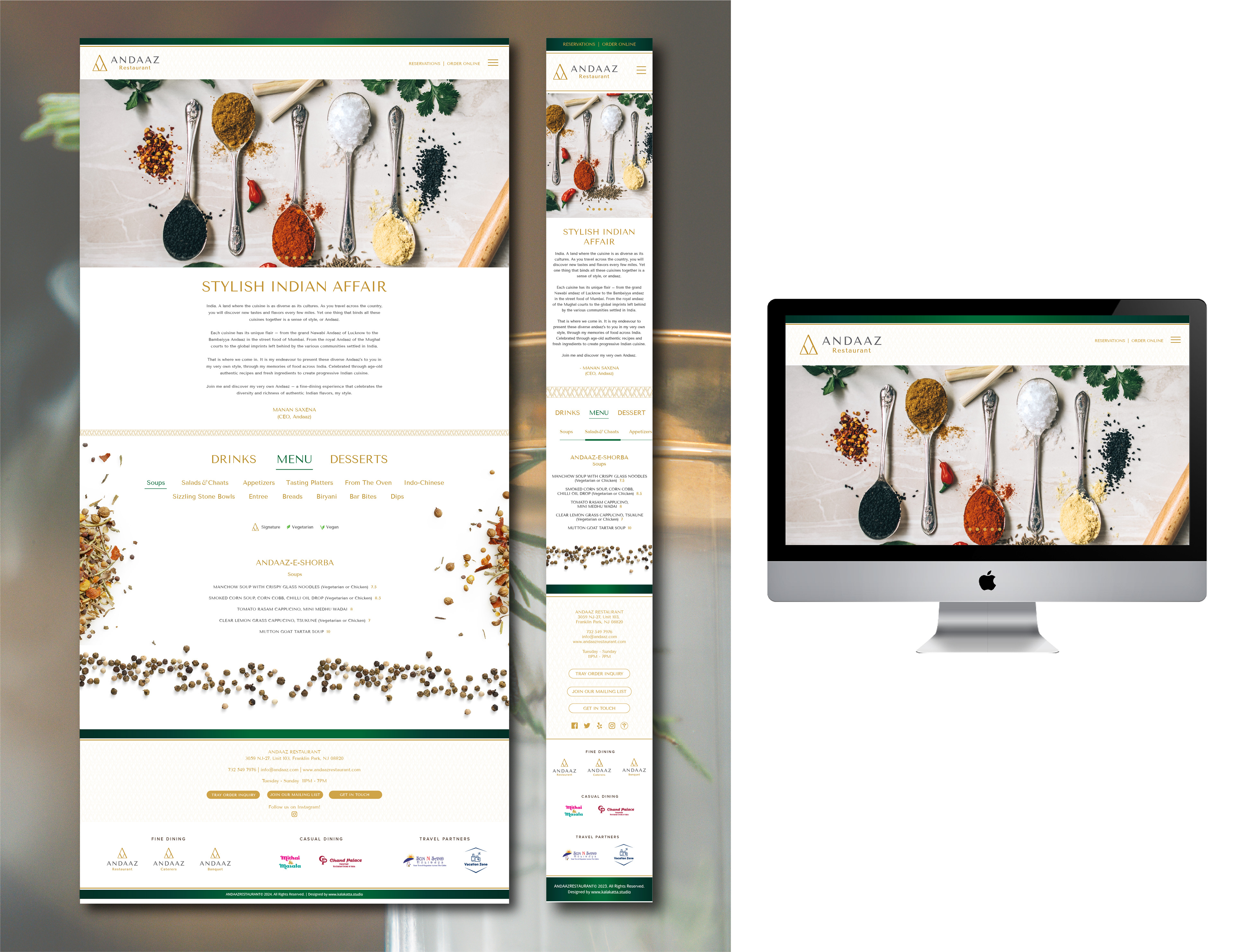
The visual identity employs Tenor Sans as the primary typeface for its minimalist and modern appeal, complemented by the Bilo font family as the secondary typeface for added warmth and balance. A color palette of gold and beige conveys sophistication and elegance, accented by deep green tones drawn from the restaurant’s interiors.
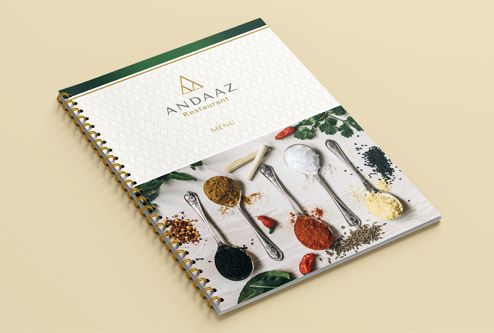
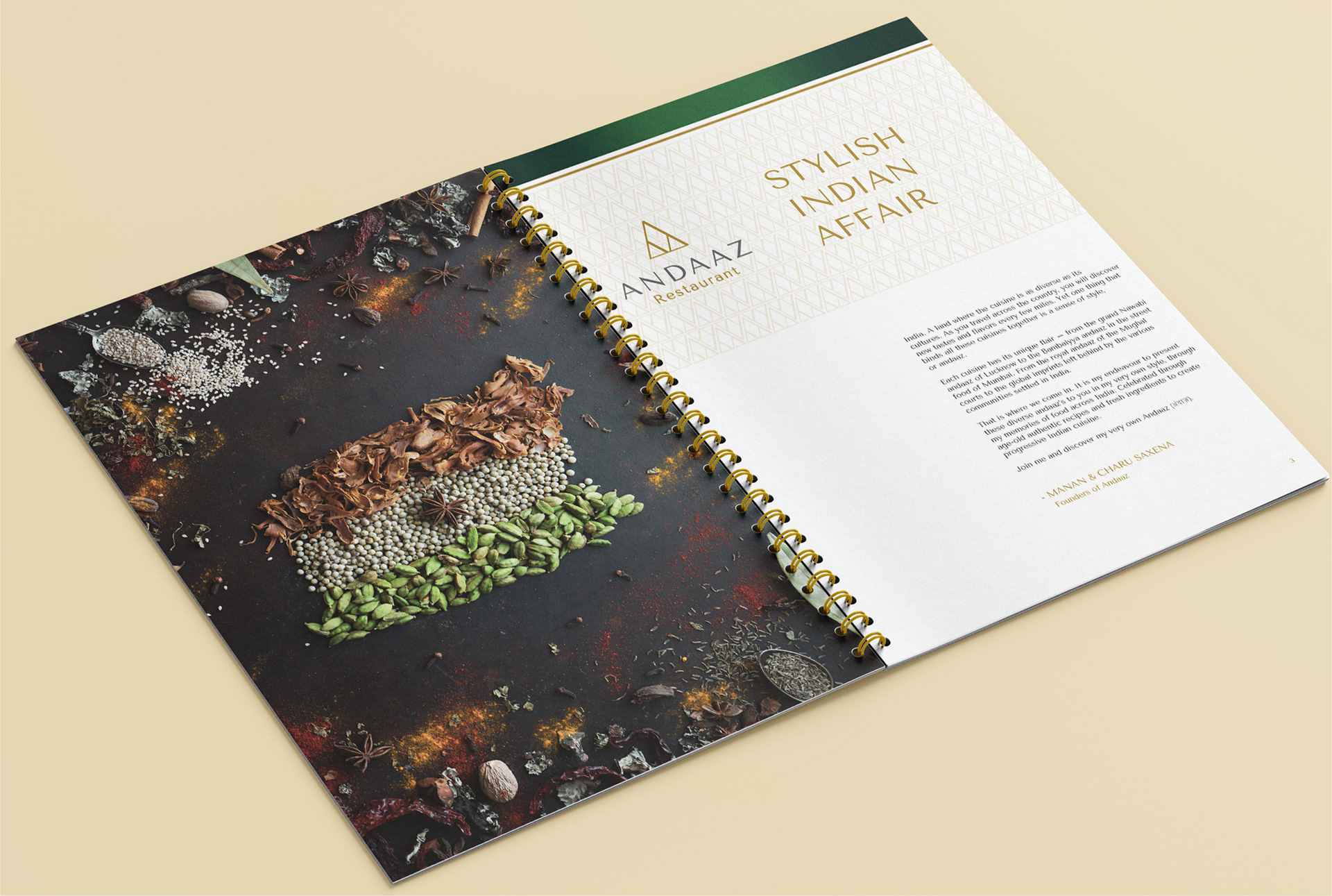
To evoke the sensory essence of Indian cuisine, the theme of Indian spices was chosen for the brand’s photography — blending texture, aroma, and artistry. This visual tone carried through all materials — from menus, websites, and hoardings to print and digital collaterals — creating a cohesive, premium brand experience.
It was a comprehensive branding and collateral exercise — Kalakatta Studio delivered a full suite of assets including menu, business cards, presentation decks for the catering division, outdoor flags, branded napkins, websites, video and more, ensuring every touchpoint reflected the brand’s refined aesthetic.
Websites designed by Kalakatta Studio:
www.andaaz.us
www.andaazcatering.com
www.andaaz.us
www.andaazcatering.com