Logo Design for PID Tree House: Where Playfulness Meets Boldness
We had the pleasure of designing the logo for PID Tree House, a kid’s activity event in the learning industry. The goal was to create something that embodied the energy and creativity of children—playful, colorful, and full of life—while maintaining a bold and impactful presence.
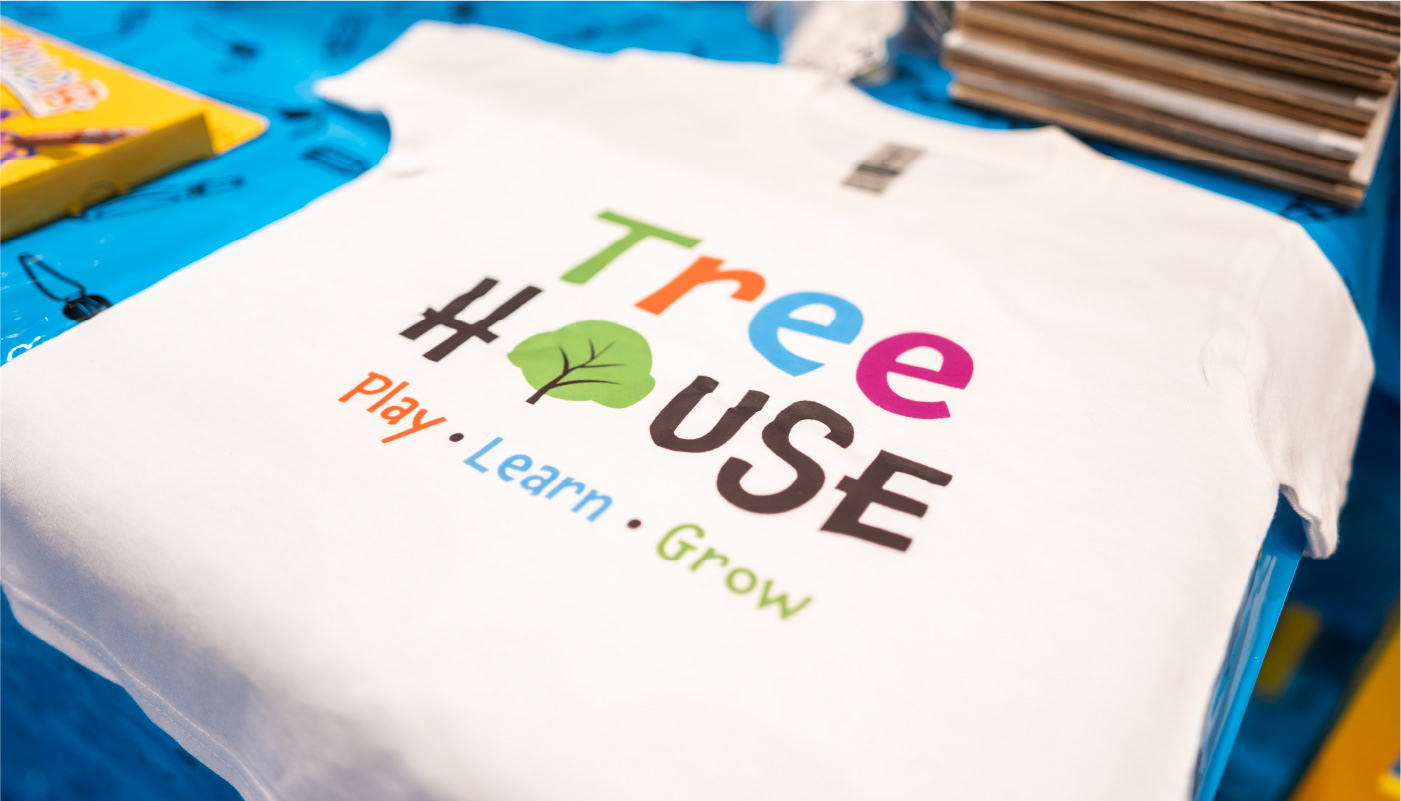
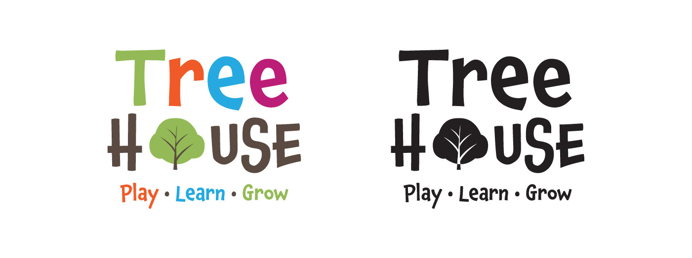
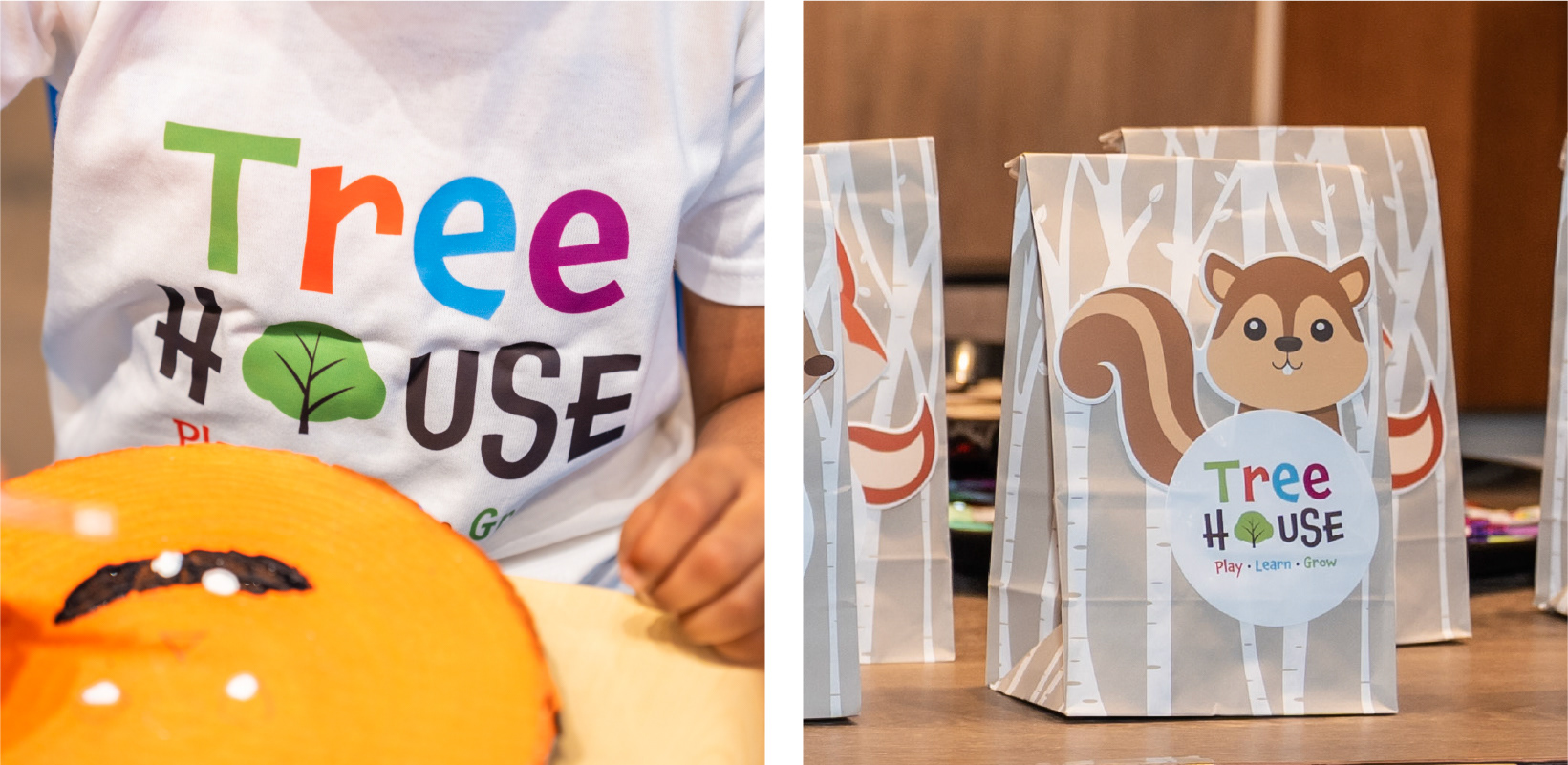
For the typeface, we selected Chaloops from Adobe Fonts. Its uneven X-height lent the design a fun, rhythmic quality, reminiscent of child-like handwriting. To enhance the playful nature, we chose bright, bold colors that would stand out and capture attention.
To tie the logo back to the brand identity, we incorporated PID Floors’ iconic tree symbol, seamlessly integrating it by replacing the letter ‘O.’ This subtle touch helped maintain the brand’s continuity while infusing it with a fresh, youthful spirit.

Creative Adventures with My Little Partner: PID Tree House Logo Design
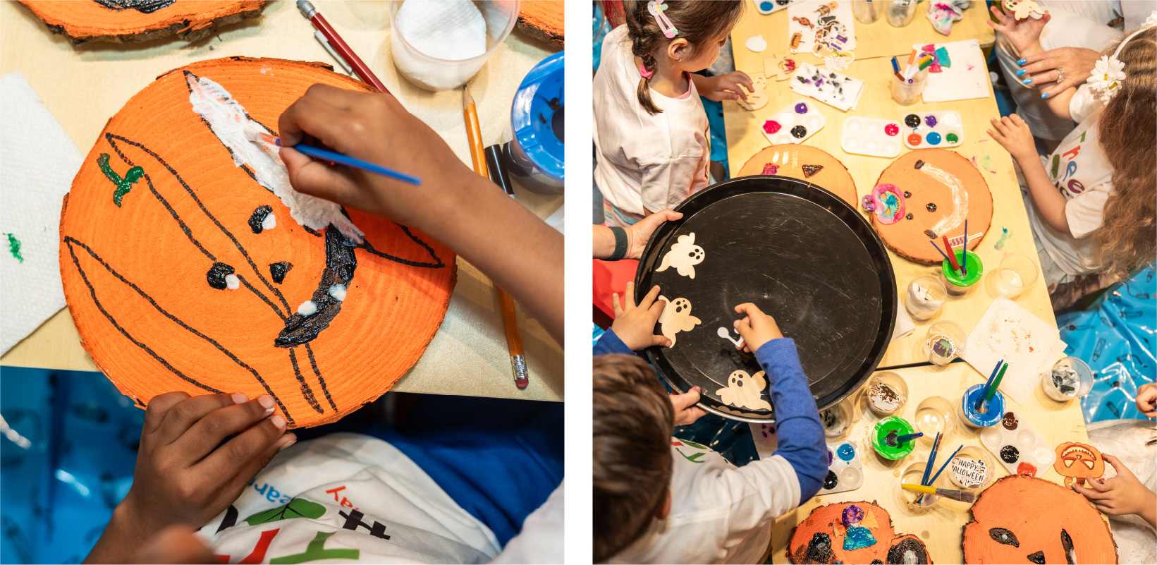
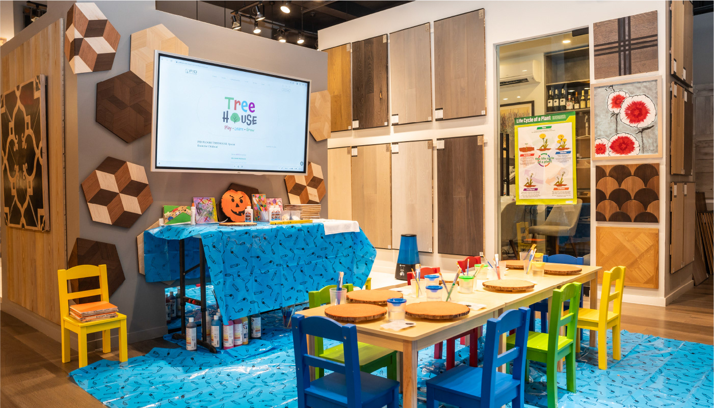
Designing the logo for PID Tree House, a kid’s activity event held at PID Floors' flagship showroom in NYC, was a memorable experience—made even more special by having my 6-year-old son involved in the process.
As we brainstormed together, he eagerly offered suggestions on color choices and design elements, adding a fresh, youthful perspective to the project. His excitement and creativity reminded me that inspiration can come from anywhere, and it truly proved that creativity knows no age.
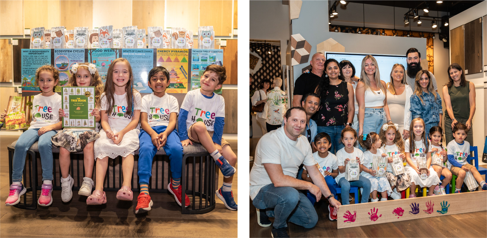
At the event, watching his face light up as the logo appeared on the big screen, t-shirts, and goodie bags was an exhilarating moment. Involving my child in the creative process and seeing him witness the birth of a brand as it came to life was an unforgettable experience.
A heartfelt thank you to PID Floors for the opportunity and for making this project a family affair. At Kalakatta Design Studio, we are excited to continue collaborating with the next generation of creatives!